OVERVIEW
Opened on the Boston waterfront in 1969, the New England Aquarium is one of the world's first modern aquariums. It is committed to engaging and educating the public through exhibits, conservation and research, community outreach, and animal rescue and rehabilitation.
THE CHALLENGE Redesign an online shopping experience based on customer and business needs.
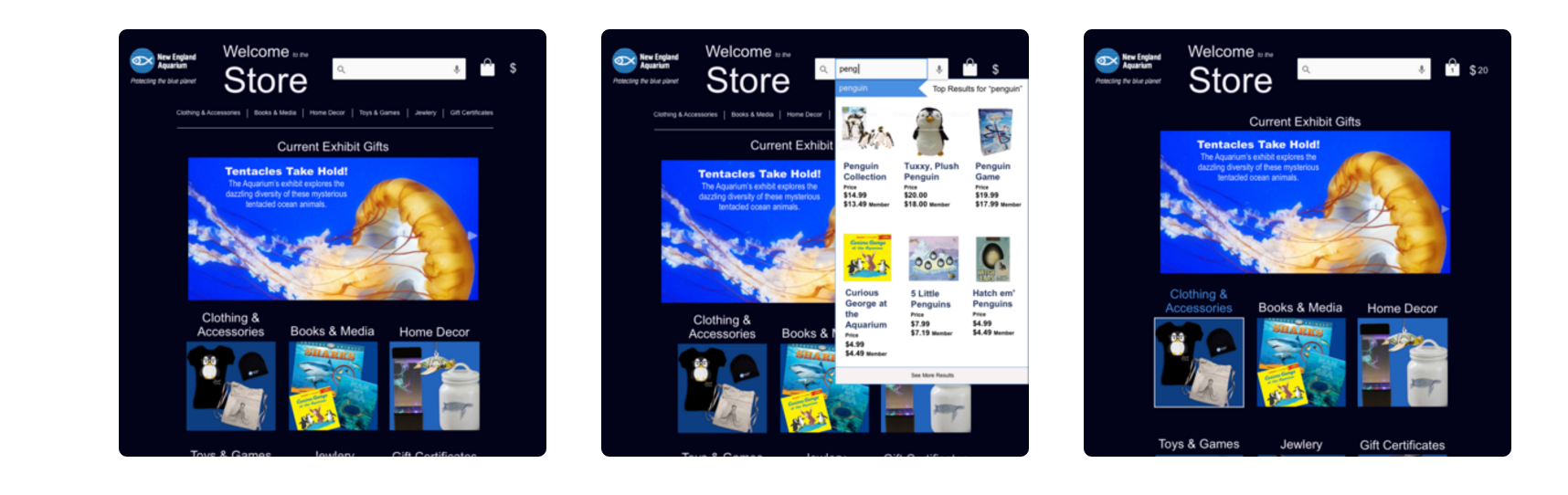
THE SOLUTION Redesigning the online shop to meet the budget-conscious Aquarium goer’s needs by allowing for price checking and tracking, and streamlining the process for finding items within budget.
MY ROLE UX Researcher, Visual Designer, Story Board Illustration
DURATION 2 weeks
PROCESS
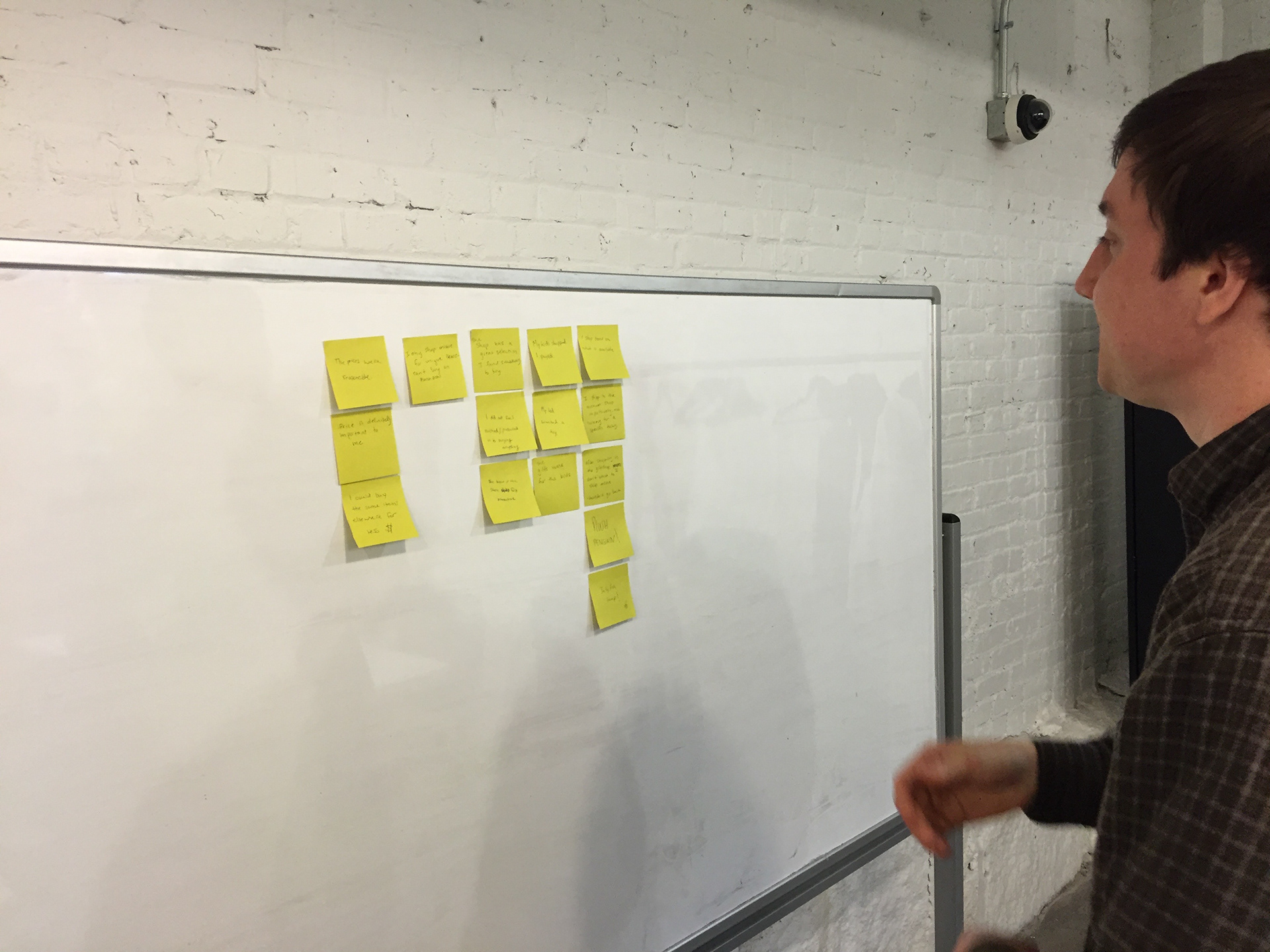
RESEARCH Usability testing of the current online gift shop highlighted inconsistent information architecture and gave insight into user preferences. It also highlighted users' motivations: they’re looking for Aquarium-specific items.

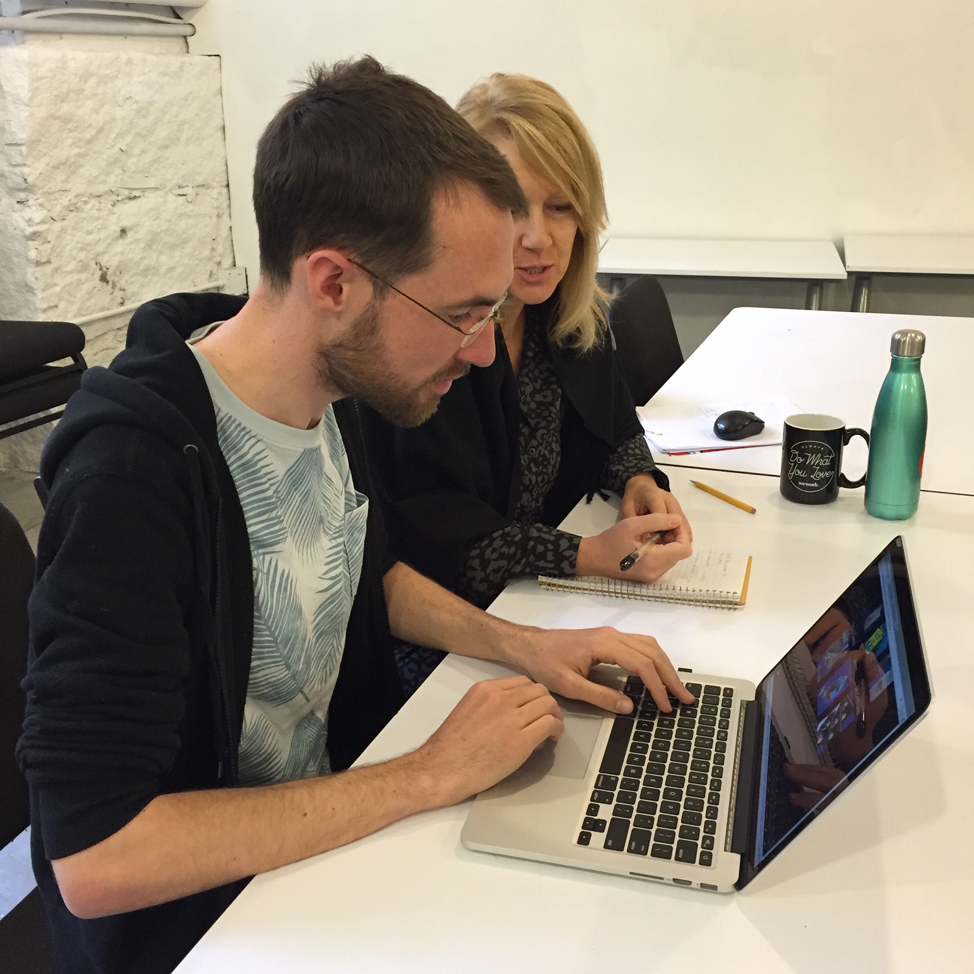
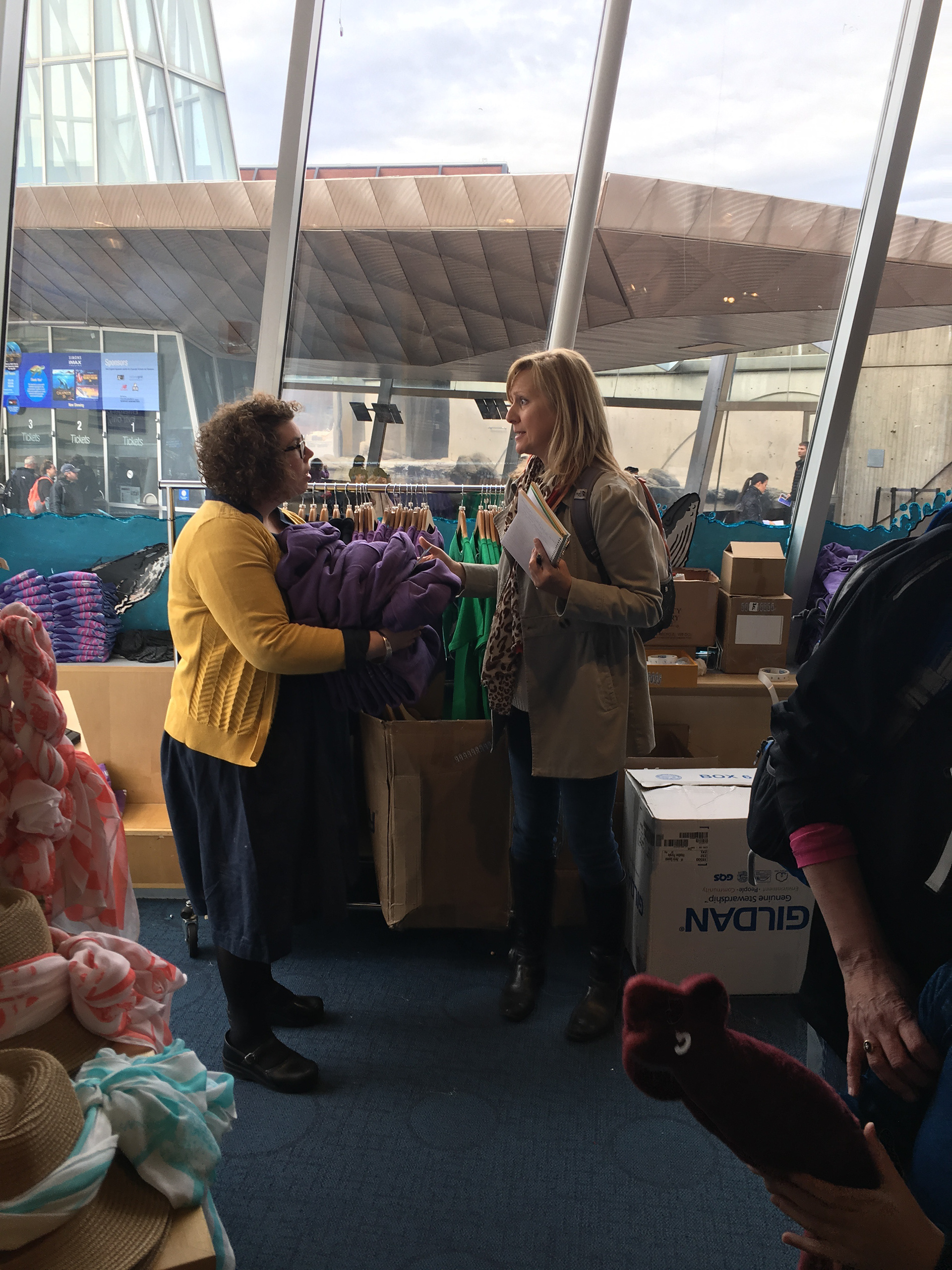
I conducted contextual interviews with 8 families and 3 staff members over two days.
The children were the reason people were shopping. “We’re here for the kids”.
Price is “definitely important.” Families bought certain things at the shop, but not the expensive items they could get on Amazon for less.
Some families noted that it was meaningful that the money went to support the aquarium.
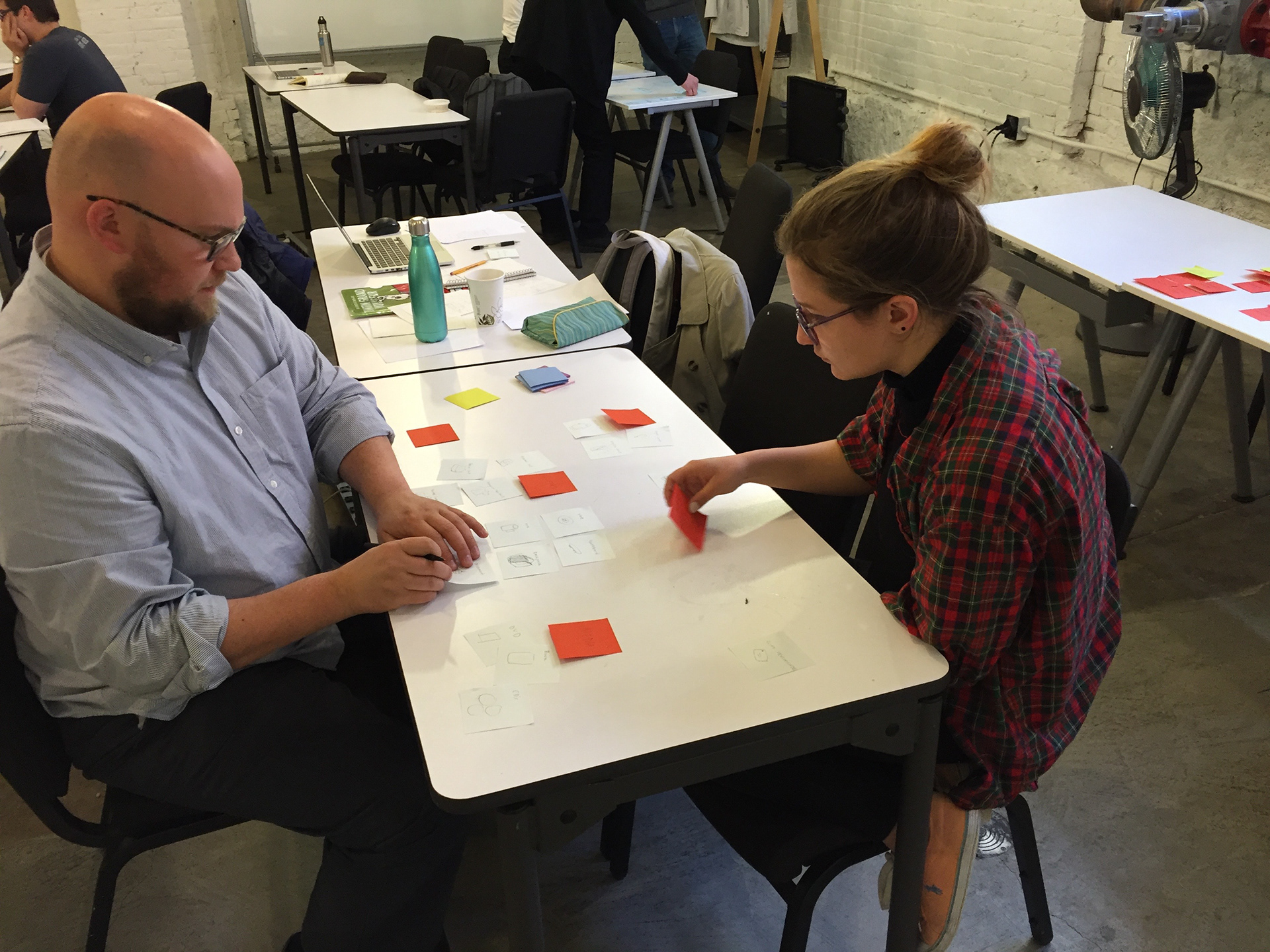
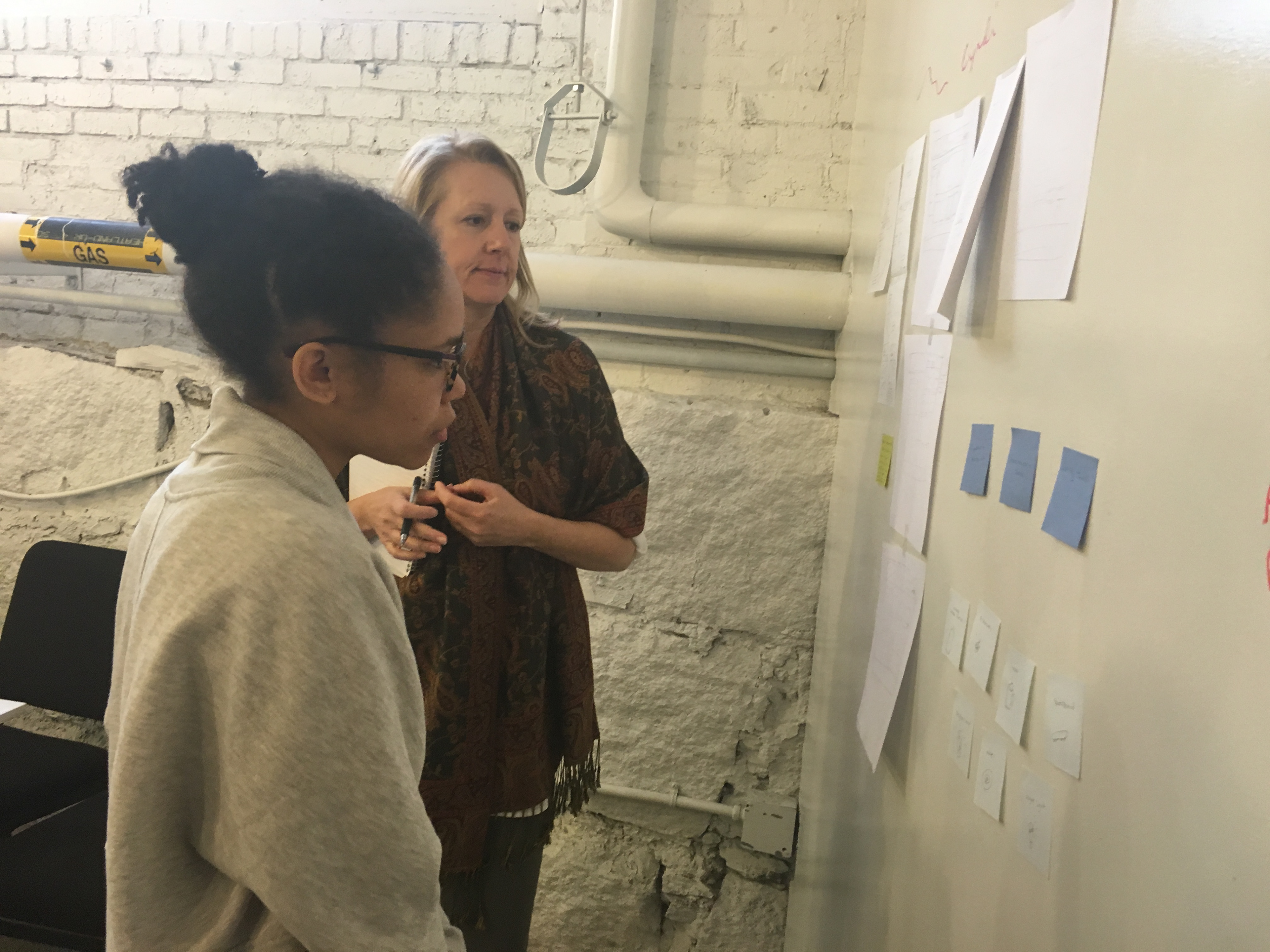
Affinity diagraming helped focus user needs and pain points.
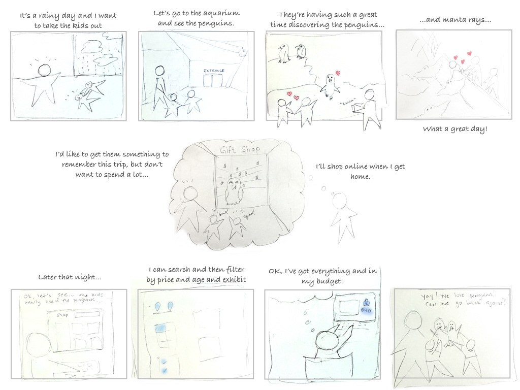
PROBLEM STATEMENT As a parent of young children, I want to buy souvenirs for each child while staying in my budget so that we can all enjoy a happy family experience and remember our visit.
STORYBOARD
IDEATION Working on the preliminary site map additionally highlighted the need for clear categories.
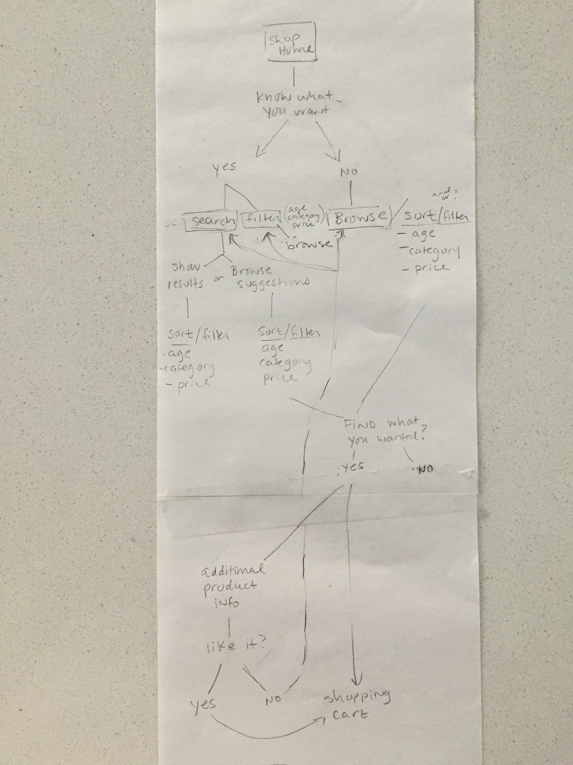
A card sorting exercise helped organize the information and present it in understandable language.
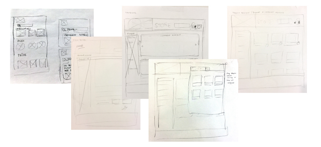
I then began sketching out possible layouts and testing them on users. Feedback brought to light that for this user, I need to show how much has been spent in addition to how many items are in the cart. Also, I had wanted to have all the filters on all pages to make it easy for the user to search, but this was confusing and took away from the images of the products.
PROTOTYPE User feedback highlighted need for better user flow with fewer interruptions